Tuesday, 29 July 2008

Oh the Old Document Paradigm

Let’s face it, the current document paradigm is way too old to be used in our digital era. When was the last time you actually created a document whose finality was to be printed? And how many documents, these days, are meant to be read in the computer and through the internet? Think of a Microsoft Word document or an Acrobat document, they really aren’t meant to be read and navigated digitally.

The most common structure of a document (be it an article, a book or anything else) is a tree structure:


Title 1
Sub-title 1
Sub-title 2
Sub-sub-title 1
Sub-title 3
Title 2
These types of structures are begging to be assessed by a tree controller like those found on the HTML help files (those that usually appear when you press F1 on any application) or on the Windows Explorer. We should be able to only see the part of the document that interests us at a given moment, and not the other three hundred pages. A large document is a pain to navigate (just think of the tiny scroll bar with very fast steps) and a pain to find information. Documents should be like web-pages except we would have several views possible including the old, tedious print view.

This document format would be suitable for web, desktop, mobile and printing, what else could we want?

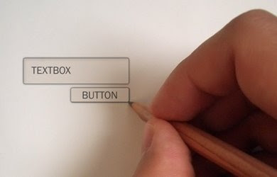
Edit: Another idea... This way of editing a document can be implemented on the web. Editing a document on the web with an interface like this would be great for collaborative work! You would edit only part of the document at a time and the system would tell the others that this particular part is being edited but everything else could still be used and changed, as if each document was a small wikipedia. I've been working with partners both close to me and on another countries and, as you probably already know, tossing around emails with word document versions attached is not a productive way of collaborating on documents at all.

Tuesday, 8 July 2008

Start with the Interface or the System?


When I was studying, every time I started doing a programming exercise, I almost always started with the interface and everyone made fun of me (including myself). I knew it was wrong but I was just having fun because that's the way (uhu, uhu) I like it!

But what if it wasn't wrong? What if it was just another way of thinking and what if it was a better one?

If we start doing the architecture and then program the logic, our natural laziness will accommodate the interface to the system. If we do it the other way round, the system will accommodate our well thought interface.

Even when it's a kind of application in which the usability is not as important as the system's performance, making the system accommodate to the interface doesn't mean it's going to get slow and buggy, and in any case, the system should be optimized so that the user doesn't have to wait more than the absolutely necessary.

In the end, the user will only see the interface, and it doesn’t really matter how the system is implemented as long as it works the way it should and the user has a good response to his interaction.

Of course both ways have advantages and disadvantages and it all depends on the purpose of the application but I believe we should, if not start with the interface, at least have different people creating the interface and the system in order not to make the mistake of designing an interface that reflects the inner system.

Wednesday, 2 July 2008

Wi-Fi everywhere

Today I was thinking about a way of having high-speed internet everywhere and I thought about this system:

Peter has a closed Wi-Fi network in his home and he decided to subscribe the Wi-Fi sharing service on the most common ISPs (including ISP A) in his area and opened his network with the necessary security rules.

From this moment on, he gets a discount from his ISP because he is sharing the network and the ISP can see that some users are using it.

John is a subscriber of ISP A so when he reaches Peter's network, he is automatically connected and is able to surf the internet within the bandwidth and time limits specified by Peter.

This way most of this country is covered with Wi-Fi networks and everyone has internet everywhere without having to pay any subscription to mobile phone networks.

ISP A wins because Peter will tell his friends how cool it is to be in ISP A when we are outside our home.


Do you think this could work? (I don't think so, but it would be a better world wouldn't it?)
edit: Hehehe this is funny. as Waldir pointed out, I've just discovered Fon's market model :P http://www.fon.com/en/info/whatsFon

Tuesday, 24 June 2008

TV Remote Control

Here's a common layout for a TV Remote:On the left, the Volume is vertical and the Channel is horizontal and the opposite is seen on the right.
Which one do you think is more intuitive? I have seen several examples of both.

This is a problem with the metaphors used and there's a clear conflict of mental concepts on the one on the right because of two things:
Previous and Next are usually connected to Left and Right.
Up and Down are not good metaphors for Previous and Next because Up means Above, which is connected to Next, but it could also mean Previous, due to the writing direction (left to right and top to bottom).

The Left layout is much more intuitive and it's not understandable why there are still manufacturers that ignore such basic mental concepts.

Monday, 23 June 2008

Two predictions

1 - In 4 years, most homes will have 5 or more devices connected to the domestic wireless network
2 - In 10 years, most devices that are not connected to a domestic network (and therefore, connected to the internet) will be considered obsolete.

What's my point? Under these circumstances, interaction cannot be based on keyboards and touch screen, because we would be flooded by these very quickly. Gesture-based, and physical widgets will probably be used a lot more, so we should think about these new paradigms.

Interactive art installations are a very quick way of testing natural interaction methods because people don't feel that they are being tested, thus, if they are not interested or if the interface is not transparent, they just quit trying to understand it.

Monday, 16 June 2008

Pressies - light buttons

The idea behind Pressies is simple: You press the rubber Hexagon and it switches colour.
It may switch between three or four colours and should be placed on a public wall in large groups, as seen on the second illustration.
It invites passers-by to communicate their emotions iconically or symbolically, forcing them to think outside of the box.
Option 1: It could be used to control a bigger display, such as the exterior illumination of a building.
Option 2: A group of Pressies could be connected to another group in another part of the world, so that if one person makes one symbol, the same symbol gets drawn in the other, in real-time. Communicating with someone else we don't know through such a narrow channel is fun and stimulates creativity.

Friday, 13 June 2008

More information on the speedometer

(image from http://commons.wikimedia.org/wiki/Image:Speedometer.jpg)

A lot of times I'm driving on a street or on a highway and I notice that I don't really know the speed limit in that place. I have to wait until I see some sign with the information.

...but cars have been increasingly coming out equipped with GPS systems, so the car can "know" the actual speed limit!

Usually on speedometers, there are some red marks indicating the most common speed limits but it would be really helpful if it indicated the current maximum and minimum limits with red and green lights. The driver could know, with a glance at the speedometer, if he was driving at a legal speed.

What do you think?